I used to work in structured environments for many years where in the field of (test) reporting, numbers were definitely king. The upper echelons of the management team demanded a quantitative style report and that’s what I delivered. I had suggested that an alternative style of reporting would be beneficial so that they could actually see and understand what was going on but they loved their graphs too much to let go of them.
While this was somewhat disappointing I never let the reporting style they demanded dictate my thought process when dealing with the unique set of circumstances and considerations that inevitably come with each and every project. In other words, for instance, I never concerned myself whether the progress graph inched another percentage point towards the exalted 100% each week or not, but rather focused on learning as much as we could within the time we had.
I’ve always had a firm belief that there’s always more than one way to do a job. Whatever worked for you at Company A would almost certainly not work at Company B as the context would be very different and I’ve prided myself as being very adaptable in that respect. My current role is at a comparatively smaller company where reporting (mercifully) isn’t governed by the digit. That said, management did ask me when I came on board to produce some reporting stats which they considered ‘normal’ – sadly, their definition of ‘normal’ turned out to be quantitative.
The management here however, are open to suggestion so with that in mind, I conducted a test on some management staff using different reporting styles, primarily quantitative and qualitative, and asked them for some honest feedback about what was really useful. I have the Rapid Software Testing course from last November to thank for so much inspiration in this area.
(Note to Shmuel Gershon – this was slightly different to the one I told you about earlier 🙂 )
I took a hypothetical project, Project 007 (Yesh, Mish Moneypenny!) and began providing them with snippets of what would constitute a potential quantitative report. We started with the progress graph:

They felt comfortable with this graph.
“Ah, you’re making good progress I see!” they said “although you’ve stalled a bit. Anything we should be worried about?”
“Would you be less concerned if the last entry had advanced past 70%?” I queried
“Yes!” came the resolute reply
“Ok, so any progress is good”, I pressed
“Definitely”
So I decided to add another metric to the fray. [sarcasm] But not just any metric, oh no, this one is the daddy of (test) metrics, the top dog, the big kahuna. The metric that spawned a million high fives, popped champagne corks, and congratulation speeches on a job well done in that everything is now ‘fully’ tested. Ladies and gentlemen, I give you the test case status graph. [/sarcasm]
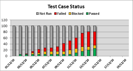
“Nice, looks like you’ll finish on time!” they quipped after a cursory glance. I must admit, this took me by surprise.
“How would you define ‘finished’”, I asked
“Well, the majority of test cases pass.” they replied. A few heads nodded sagely in agreement
“Did you check the legend at the top of the graph?” I asked
“No, wait….what does red mean….oh no, wait, this isn’t good at all. Oh dear!”
“Still think we’ll ‘finish’ on time? I pressed
“No chance!” came the resolute reply
The discussion then quickly turned towards defects – how many – what severity, so I added another metric to the ensemble. Defect arrival rate (which simply means the number of (project) defects that were created after each day).

There was around thirty seconds of synchronised head twisting, much like an audience watching a very rapid tennis match as they cross referenced the defect data with the test case data. It made me a little dizzy.
“Why weren’t there more defects being raised around the time the majority of the test cases were run?” they asked
(When asked for clarification they meant between the 7/12/10 and 15/12/10).
“I think you’ll find there are around the same number of defects raised in that time frame” I replied.
They considered this for a moment, “So you failed thirty test cases on a set of Minor defects?”
“Yes” I confirmed. “Would you rather I had passed the test cases despite the defects?”
“No, of course not” came the reply.
They looked puzzled “But what about all those Major and Critical defects created between the 1st and the 7th?”
“Ah, the majority of those were encountered while not actually running any test cases” I stated
They took a moment once again to consider this.
“You are fully testing this product, aren’t you?” that asked
“Can you define ‘fully tested’, please?” I countered
[Lots of mumbling…]
“Well, fully tested obviously means testing all the requirements” they agreed
“Ah, I suspected you may say that – All requirements are ‘checked’ as part of the test cases” I assured.
[More mumbling…]
“Would it help if I provided one more metric?” I queried
“Yes!”
Enter the cumulative defect count…….

[Even more mumbling…]
“This doesn’t help us” they retorted.
(I didn’t expect it would, but wanted to see their reaction)
Now obviously I was leading them up the garden path and I was deliberately playing devil’s advocate. Why? To illustrate to them that misuse of numbers as part of reporting can be dangerous and misleading. Although I’ve paraphrased a lot of the dialogue here, I don’t want to portray my management in a bad light, or for you to have a poor opinion of them. To their credit, once they saw the failure of this particular reporting style (in this particular context) they were open to alternatives but I wanted to dispel any expectations that numeric based reports would be a way forward for them.
Enter the ‘Low-Tech Dashboard’ (and their response) – coming in part 2 – watch this space.

I’m really looking forward to part two!
Excellent post Del, and very well written. It’s been a while since I’ve laughed so much when reading something online. Although a very serious post ,your little sarcasms here and there really made me chuckle 🙂
Thanks for sharing.
[Del’s reply: Thanks Darren!]
Totally agree with Darren, you really have me hooked here and I´m very much looking forward to part 2 since this is a problem I´ve encountered many times in the past.
Unfortunatly it´s kind of a dealbreaker if you have management that are willing to listen to your advice.
If not, well then it´s a long journey towards becoming a “trusted advisor”.
[Del’s reply: Hi Kristoffer, I assume you mean ‘management that are not willing to listen to your advice’ – that can be a dealbreaker for sure.]
Excellent post Del. I’m really looking forward to part two about your thoughts on Low Tech Test Dashboards. I just read a good post by Paul Carvalho about his positive experiences in using them (and his clever strategy of positioning them in office locations where they would be noticed by the development team). See: http://swtester.blogspot.com/2011_03_01_archive.html
One thing struck me as very ironic in reading through your post. While I agree the value of the first chart is less than useless (in that the story it tells is highly misleading), I found a lot of the information in the last three charts (especially the information color coded in red) to be (a) useful, (b) informative, and (c) a nice, clean way of communicating important information. So agree with the majority of the criticisms of such charts (“the fact that X number of tests exist and Y% of them are passing doesn’t tell us a whole lot because the vast majority of the tests might be virtually useless,” etc., etc.)… even so, if I were managing a dozen projects with 50 testers each, I would find charts 2-4 interesting to look at, and they would spur interesting questions. Would I regard them as accurate representations of “the truth”? Absolutely not. Even so, would I prefer to see them (knowing their limitations, knowing that people’s biases might well influence how they are reported, etc.)? If the time spent gathering the information was relatively low (a big if) and if the teams who were reporting such information were clear that the data in the reports weren’t being interpreted as “telling the whole story,” then yes. I would like to see those reports…. probably in addition to the Low Tech Test Dashboard information.
Another way of saying that is that you did a superb job of concisely highlighting the inadequacies of chart one by clearly presenting “executive summary” data in subsequent charts that clearly demonstrated that there were massive underlying problems… through the use of charts.
[Del’s reply: Hi Justin, thanks for taking the time to comment. Combined reports in the way you suggest are indeed a possibility and was in fact suggested by my management as a compromise (see Part 2 of this blog post for my response)]
Del, this is a great way to show people how metrics can confuse management. Very inspiring. I can’t wait to use it myself soon 😉
/Anders
Really good piece. I enjoyed it. I also envied your opportunity to have the time to re-educate the management. It was important that you did so constructively, leading them on to inescapable conclusions instead of losing your patience and antagonising them.
Lies, damn lies and statistics. However, without some data as reference I would just be a blind man in the kingdom of the blind with no cunning one eyed chaps to guide the way. Bring on part 2…
Awesome post. Had LOL while reading it. You made management learn an important lesson. Look behind the numbers and see the real story .
lovely post. And very inspirational.