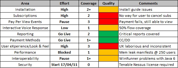
In my last post, I talked about how I presented a set of individual quantitative reports to some management figures to illustrate how they could be misleading and why it was necessary to understand the story behind the numbers rather than simply place value on the numbers themselves. After I had led them successfully up the garden path, I presented a low tech dashboard dashboard for the same hypothetical project (Project 007). Before doing that I asked them to put the quantitative reports to one side for the moment.
After showing them the dashboard, the immediate reaction was positive.
‘Ah, this looks interesting’ they commented excitedly.
I could see their attention was immediately drawn to two things – Key Area and Comments. I guessed that if you’ve never seen low tech dashboards before (or any sort of dashboard for that matter), you attention is most likely going to be drawn to the elements that need little or no explanation. I could see their eyes flick between the extremities trying to understand the data.
“So what’s the initial gut feel about this? What jumps out at you?” I began
“Well, it’s good to see the breakdown of key areas” they replied
“And you see value in that, why?” I pressed
Almost immediately, they said “Well, it’s more informative!”
“It’s more useful to see the key areas!”
“It allows us to better assess any risks!”
“And what are the risks here?” I asked
“Well…”
“Some fields may require a bit of explaining” I interrupted
“Yes, what does Effort actually mean?”
“What about Coverage?”
“Don’t forget Quality!”
“Let’s start with the simplest” I proposed, “Does everyone understand the fields Key Area and Comments?”
Heads nodded in unison. “Yes, they’re self-explanatory”
“Ok, so let’s look at Quality first” I suggested
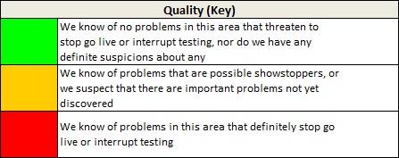
“So just think of this as a traffic light status”, I added.
This seemed to make sense. No real questions.
“Ok, so let’s add another”

“So what about a ‘Medium’ value so we have Low, Medium and High efforts”, they queried
“We could add that”, I replied “But the point of this field is to help you understand which key areas we’re focusing on at any point in time”
“So how do we know how much you’ve tested?” they added
Time for the coverage legend…

After a few nodding of heads and confirmatory noises the questions started to come:
“So if something is green does that mean you’ve tested it thoroughly?” they asked
“Not necessarily”, I replied
“…and does that mean that the coverage will be 3 if you’ve got an effort of High?” another followed
“Absolutely not”
“So what if something has an Effort of ‘None’ and Coverage of ‘2’?” they contested.
“That would depend” I countered “It could be that a key area merits inclusion in the dashboard but is tested implicitly as part of other key areas, but I’d make that clear in the comments. However, as a normal rule of thumb I’d try to avoid that by stating that anything included in the dashboard will have an explicit test effort associated with it”
“So there are no dependencies between effort, coverage & quality?”
“Not really, no.”
“Hmm, We like it”, they replied “But how do we know when you’re finished?”
“Define ‘finished’” I countered
“Well, when all your test cases are complete” came the response
“Not really, but remember what we’re trying to achieve with this” I said “We’re trying to take your focus away from numbers so you can understand the story behind them. We could easily overload the dashboard with many other bits and pieces of information, but the effectiveness of this particular dashboard lies in its simplicity”
“Compare this to the previous graphs showing all the numerical information” I continued “All you’re being presented with as part of the ‘traditional’ reports are numbers – 70% complete, 100 test cases, 134 defects raised, etc. but how does that really help you when it comes to making important release decisions?”
“We agree, but what about an amalgamation of the two – dashboard and graphs?” they queried
“That’s of course a possibility, but previous experience of distributing such reports has suggested that your attention would be drawn to the graphs and numbers FIRST, and the dashboard LAST. Like I said, I want to shift your attention away from the numbers and understand the story behind them.”
“To address your original question of ‘how do you know when I am finished’ – Well, I could test for as long as required and continue to gather new information about the product, but in terms of whether something is good to go or not, I would focus your attention on the ‘Effort’ and ‘Quality’ fields. If they are ‘Go Live’ and ‘Green’ respectively, then I’m suggesting that key area is ready for acceptance”
Our discussion went on but they admitted that the dashboard was a more effective way of communicating critical information.
Now, to put it into practice…… 🙂

well written and explained. I love your dashboard view. Might try something similar in the coming release. Thanks for explaining in detail.
[Del’s reply: Thanks Shilpa. Glad you enjoyed it. :-)]
Excellent two part blog post Del. This second part is something you could pick up and apply in a workplace straight away.
Very nicely written and explained.
Thanks for sharing 😉
Great post. I’m actually using the same dashboard currently for test reports in my organization since since finding http://www.satisfice.com/presentations/dashboard.pdf back January. It has been well received.
I have a dashboard view for each build that we test, but have combined the results into an overall dashboard as well. Management really likes that view.
Looking forward to reading your other posts as well to help improve testing on my team.
Perfect work you will have completed, this site is essentially cool with great information.